The brief:
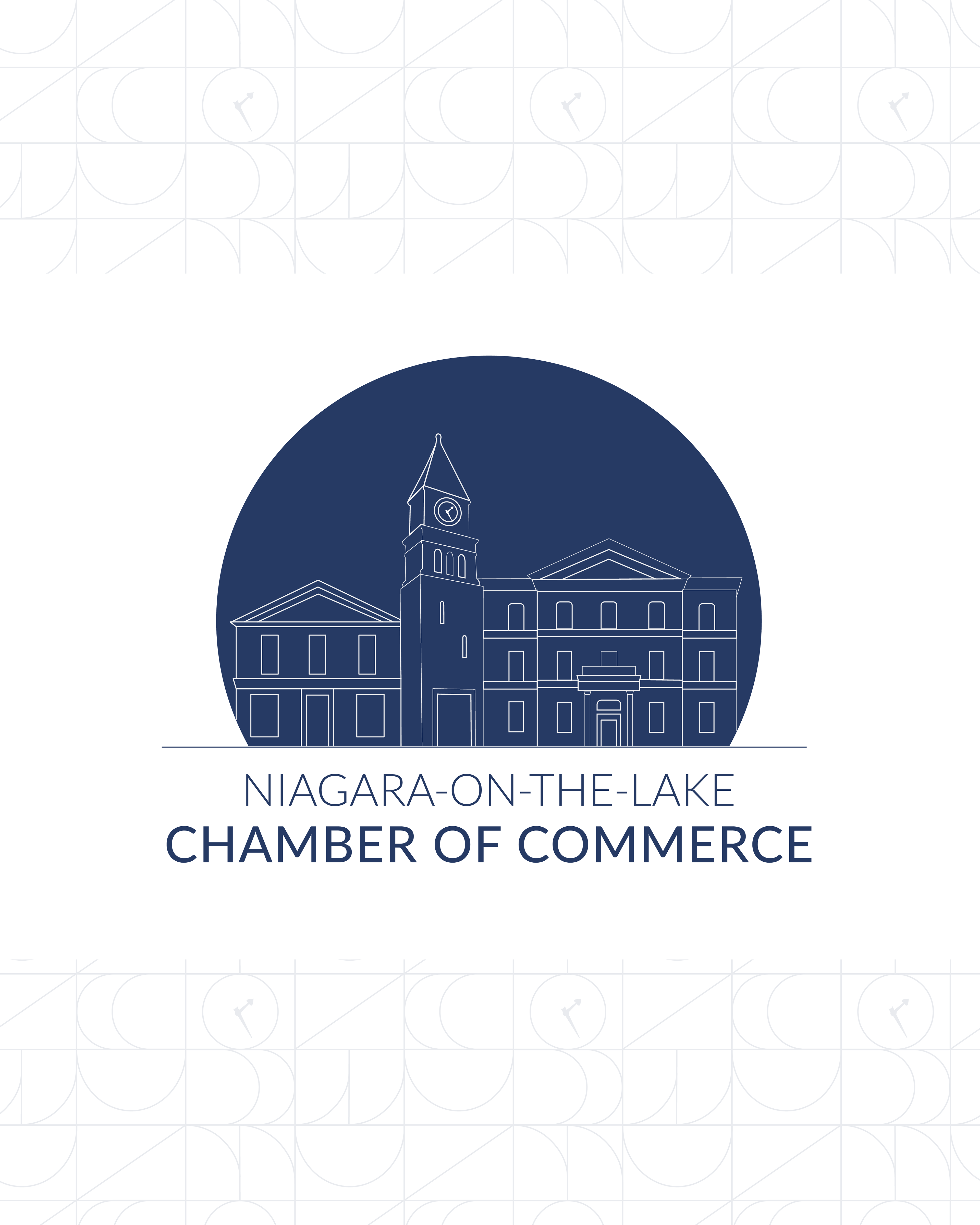
The Niagara-on-the-Lake Chamber of Commerce has been advocating for local businesses in one of Ontario's most historic towns for decades. Their existing brand no longer reflected where they were headed — they needed an identity that honoured the past while feeling relevant and modern. They came to BCIC with a clear creative direction: the new logo had to incorporate the Chamber building, its iconic clock, and the neighbouring LCBO building — architectural landmarks that define the heart of NOTL.
What I did:
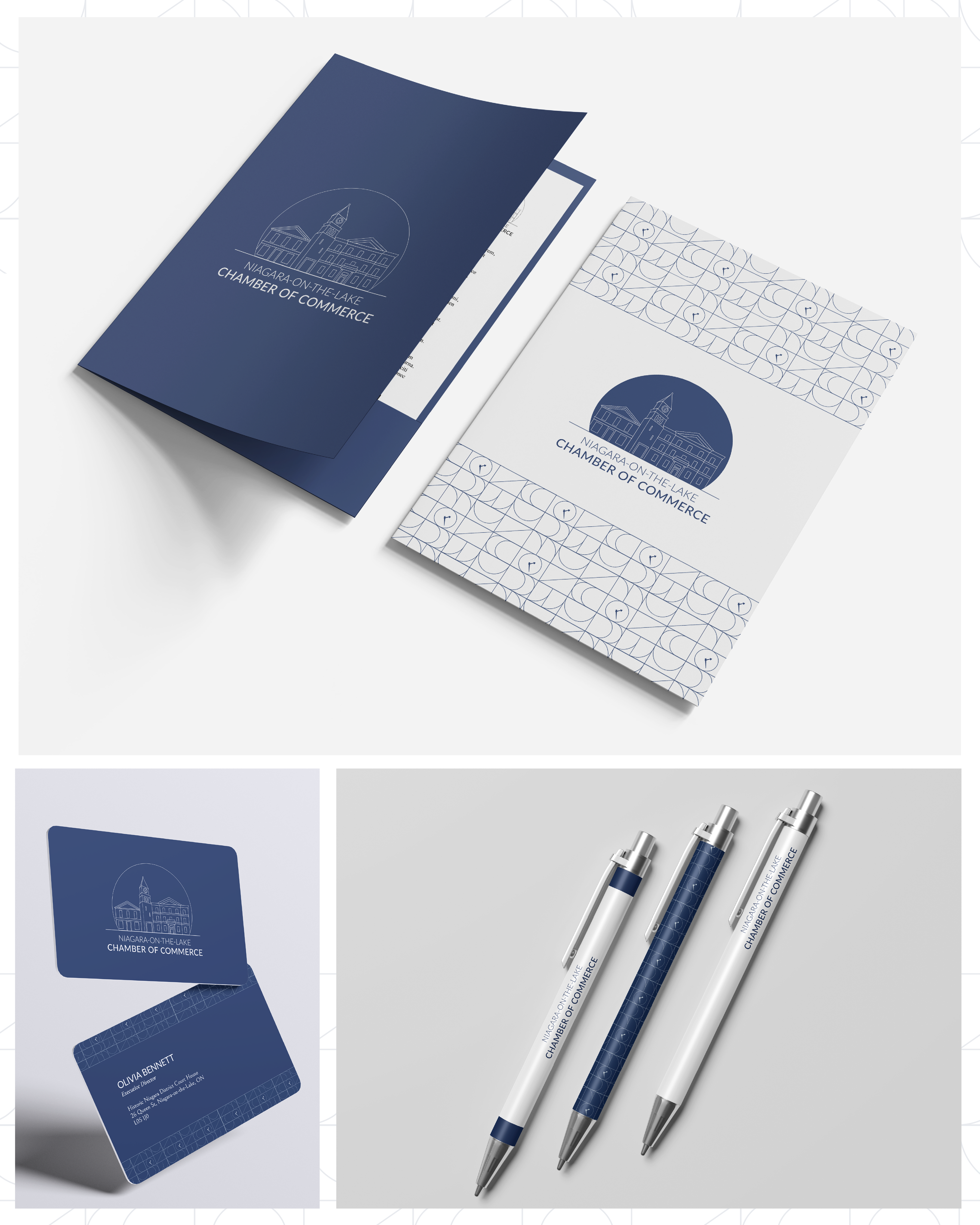
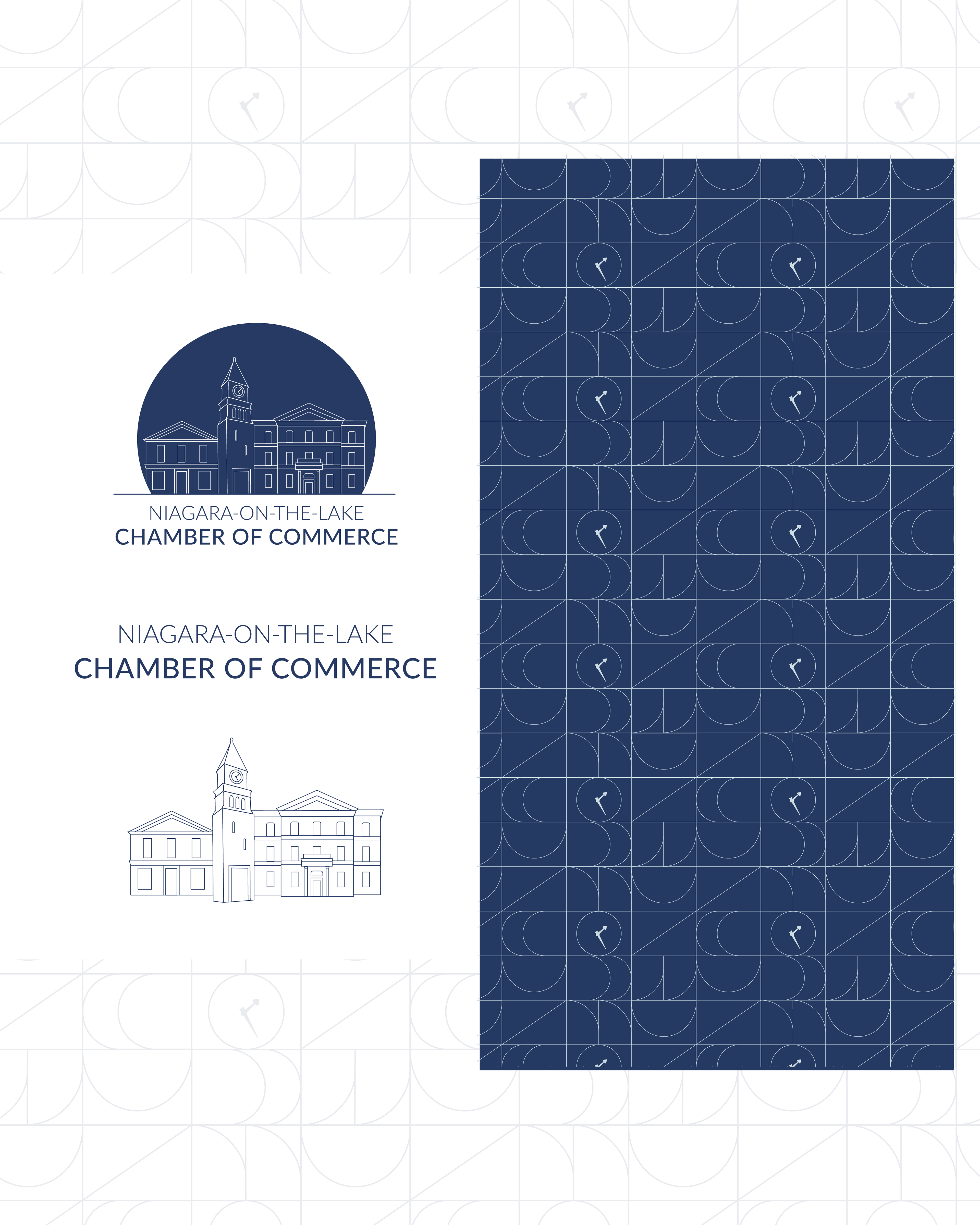
As the sole designer on the project, I took the brief from logo creation through to a complete brand guidelines document. Working from a mood board already defined with the project manager, I developed multiple logo concepts that translated the client's architectural vision into a clean, modern mark — balancing heritage detail with contemporary restraint. Once the logo direction was approved, I built the full brand kit: responsive logo suite, colour palette, typography system, and brand guidelines ready for application across digital and print.
The outcome:
The new identity launched in late 2025 and is actively in use across the Chamber's website, communications, and member-facing materials. The project was covered by both Niagara College and local media. The Chamber's program manager noted the work "modernized our brand, streamlined our online presence, and gave us the tools we need to better support local businesses."
The new website — built separately by another team member — applies the identity system across a fully redesigned digital experience including member search and ecommerce capabilities.